QuickPlay Media
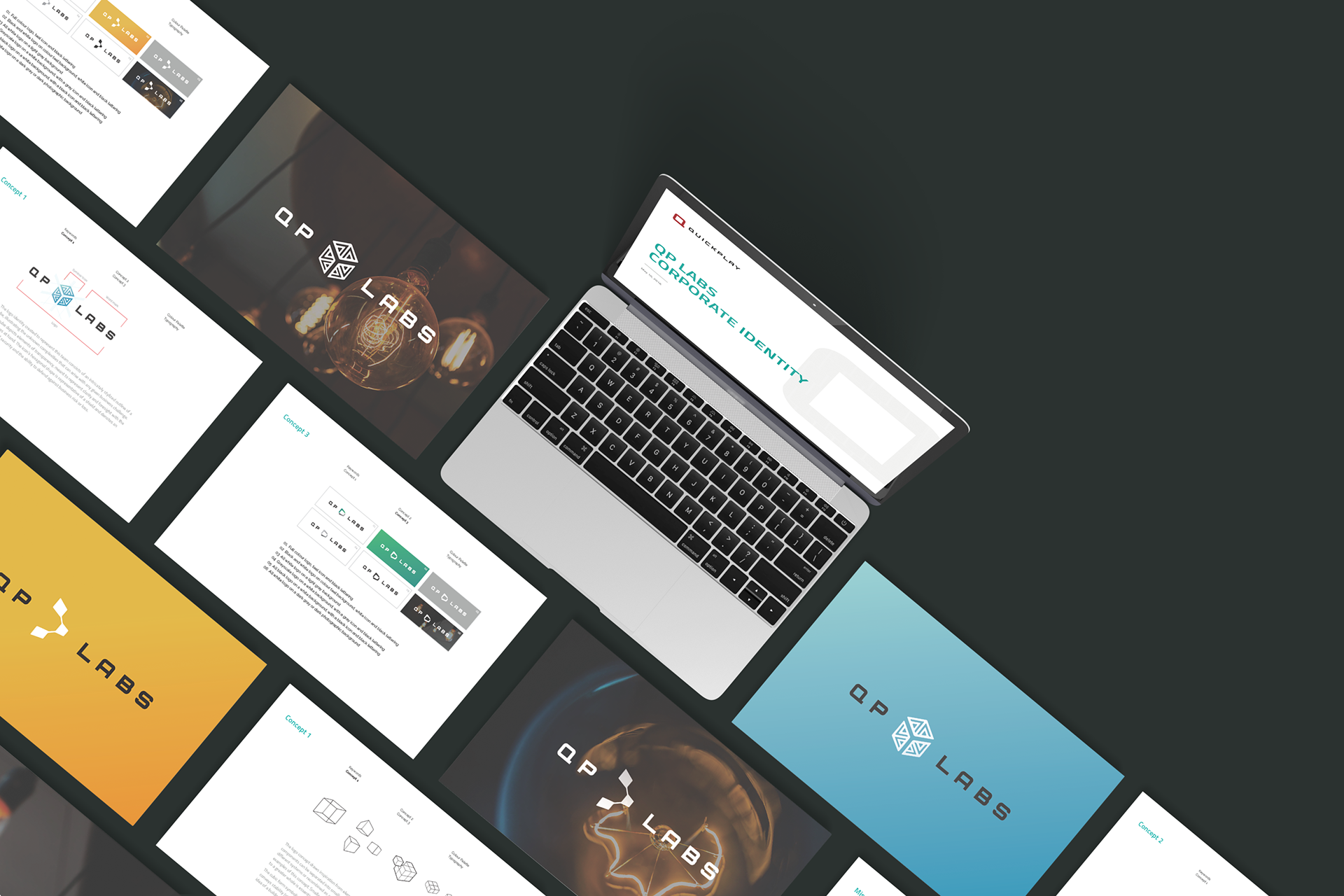
Visual identity concepts for an internal software engineering team assembled to de-risk complex, large scale deployments and solving challenges using innovative solutions and technologies.
Project Brief
Conceptualize the visual identity of the QP Labs team so that it can operate as a standalone function, and feel distinguished within the organization.
Visualize 3 logo concepts and rationale for each to be reviewed by senior leadership, and voted on the broader organization.
Tie in elements from Quickplay Media's recent brand refresh.
Produce simplified guidelines illustrating the usage of the new visual elements, typography and logo.
My Role
I was responsible for the ideation and execution of the 3 identity concepts.
Before producing any creative, I met with the Chief Technology Officer, VP of IT Security, and other technical team leads to conduct research and formulate a detailed creative brief.
After gaining a better understanding of the teams mandate I was able to conceptualize some logomarks that accurately capture the complexity of their function and significance within the organization.
Design Rationale
The logomark consists of a intricately stylized outline of a cube, illustrating unknown complexities that may arise with any given business challenge.
The element of transparency and that you can see through the cube depicts the notion of clarity and having a clear view and foresight on the objectives at hand.
The icon's hexagonal shape is representative of a shield and denotes security and the team's inapt ability to defend and eliminate the chance of business risk or loss in any way.
The logo concept draws inspiration from elements of modularity: the degree to which a system's components can be separated into smaller parts that can either function independently in different systems or recombined as a whole. The Rubik's Cube or the game Tetris are good examples of this concept. Smaller, self-sustaining elements working in tandem of, and parallel to a greater whole is essentially how the Quickplay Labs team functions.
The cubic form, with its many sides and edges symbolizes varying, complex business challenges. The square shape conveys stability (strength), perspective, security, foundation and dependability. Consider the idea of building blocks and how they all play a part in creating and supporting a larger structure.
Concepts