Mi Hermano Barbershop
A visual identity, brand development & design for Mi Hermano Barbershop, independently owned and operated in the heart of Toronto's trendy Harbour Village.
Project Brief
Create a visual identity, brand strategy and supporting assets to represent 'Mi Hermano', a new independent barbershop in Toronto's Harbour Village.
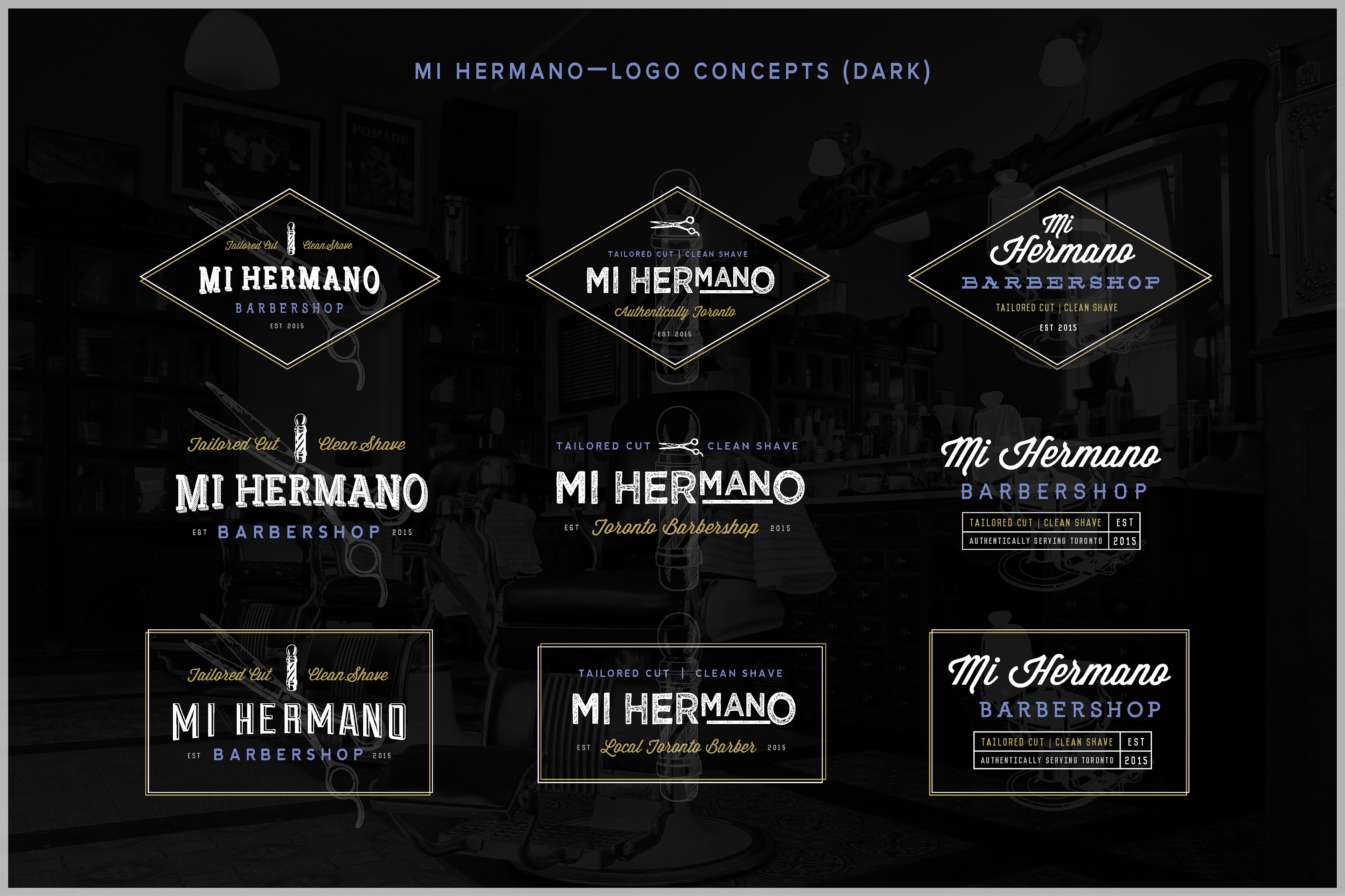
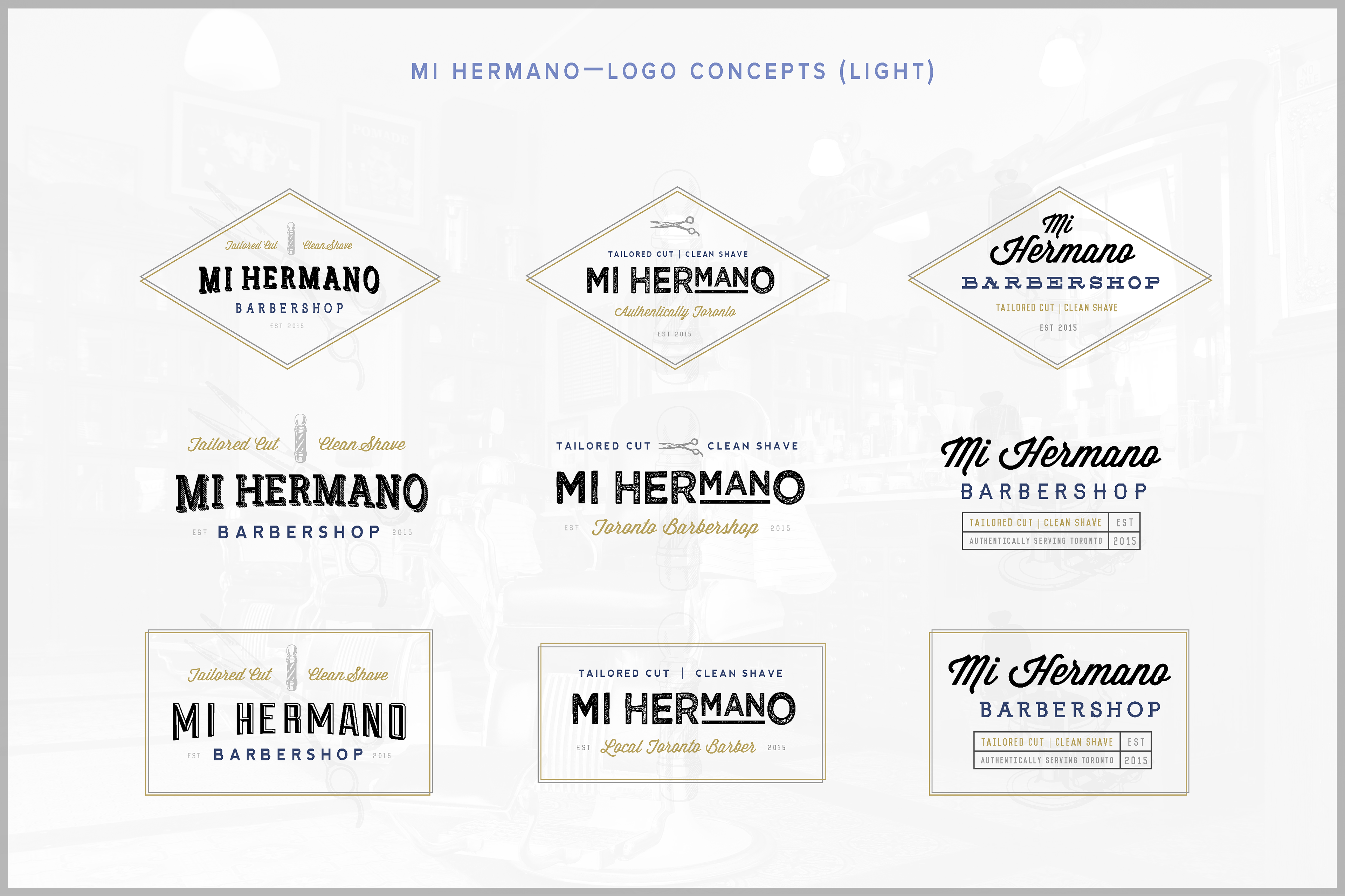
The logo should feel nostalgic and familiar, drawing inspiration from retro typography—a modern take on a traditional aesthetic.
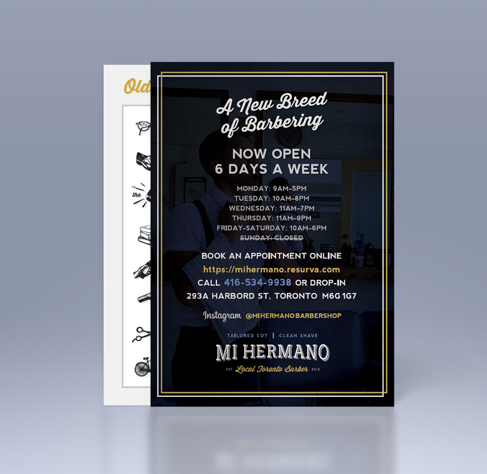
Ideate taglines that can be used interchangeably throughout various brand assets.
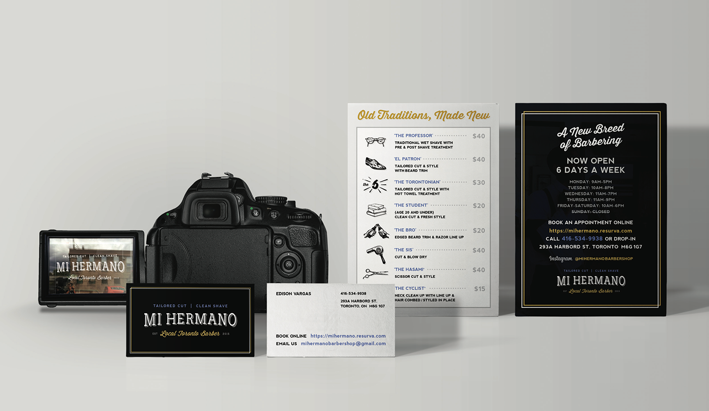
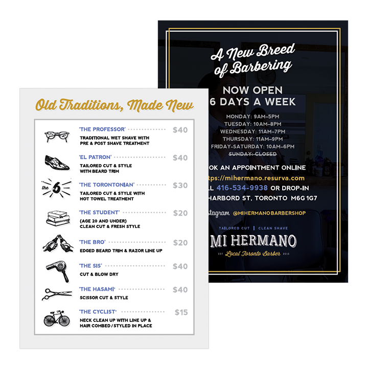
Develop a menu with memorable service names, so that regular clients can remember 'their usual' cut.
My Role
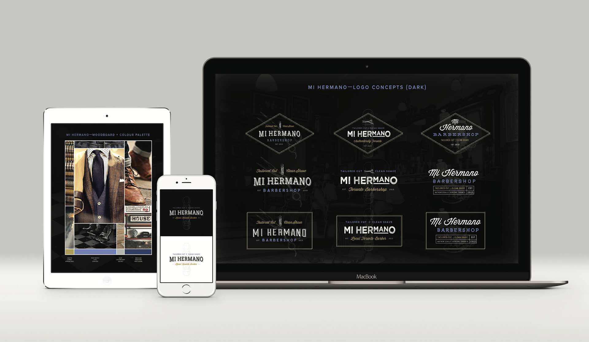
I produced a series of logomark concepts showcasing numerous typographic treatments with flexible lockup compositions so that elements from various lockups could be used interchangeably.
I wrote copy for a series of brand taglines and service menu offerings with the grooming traditions and techniques that are passed down from a brother or father figure top of mind, but modernized for today’s generation.
I designed a variety of supporting assets such as business cards, social media graphics, shop merchandise, and signage for the store front shop window.
I provided art direction to external vendors such a vinyl signage installer in order to achieve a cohesive and consistent look & feel.
Design Rationale
I created a moodboard to accurately capture the client's vision through inspirational imagery, keywords, and colours to help guide the decisions and design direction.
Drawing inspiration from the name of the shop which is based on the aspect of brotherhood (Mi Hermano, translates to 'my brother' in Spanish), I ensured that a sense of camaraderie, and inclusion was captured throughout all visual elements.
The logo possesses a modernized, retro inspired design with the addition of diagonal pin strip drop-shadow, slab lettering and traditional 1950's script use for the wording "Local Toronto Barber". Design Concepts